Office Equipment
Overview
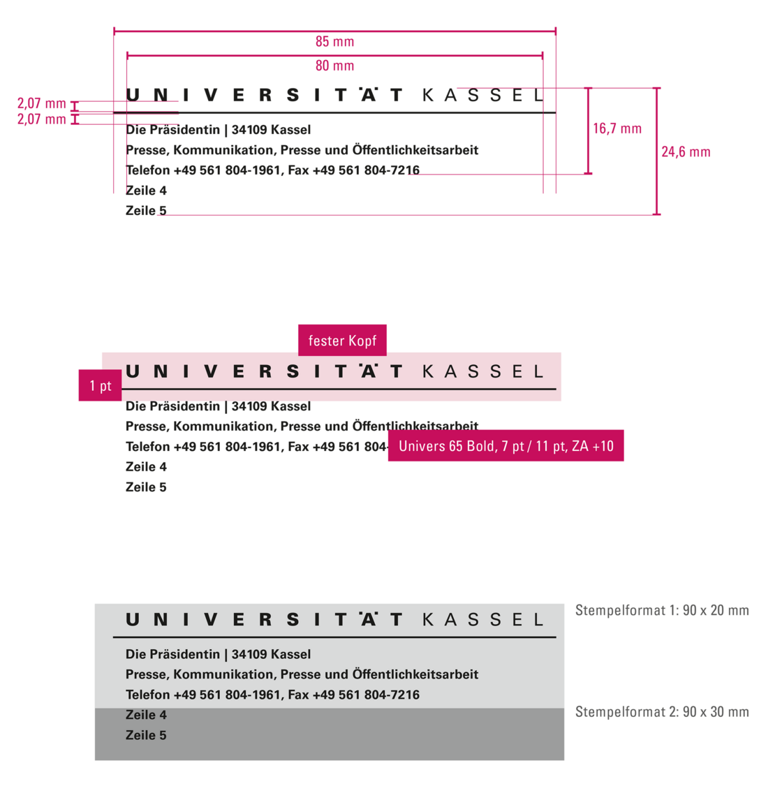
Letterhead
Contents of the logo case: letterheads (German/English), logos in various file formats and resolutions, department logos (German/English), publications
- Faculty of Human Sciences: www.uni-kassel.de/go/cd-vorlagen_fb01
- Faculty of Humanities: www.uni-kassel.de/go/cd-vorlagen_fb02
- Faculty of Social Sciences: www.uni-kassel.de/go/cd-vorlagen_fb05
- Faculty of Architecture, Urban Planning and
Landscape Planning: www.uni-kassel.de/go/cd-vorlagen_fb06 - Faculty of Economics and Management: www.uni-kassel.de/go/cd-vorlagen_fb07
- Faculty of Mathematics and Natural Sciences: www.uni-kassel.de/go/cd-vorlagen_fb10
- Faculty of Organic Agricultural Sciences: www.uni-kassel.de/go/cd-vorlagen_fb11
- Faculty of Civil and Environmental Engineering: www.uni-kassel.de/go/cd-vorlagen_fb14
- Faculty of Mechanical Engineering: www.uni-kassel.de/go/cd-vorlagen_fb15
- Faculty of Electrical Engineering and Computer Science: www.uni-kassel.de/go/cd-vorlagen_fb16
PowerPoint Templates
Business cards
Stamp Templates